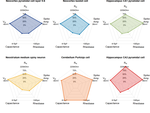
Radar Diagrams: Electrical Properties of Brain Cells
Radar plots are also known as spider web or polar plots. These charts are useful for conveying information about multiple quantitative variables using multiple axes, arranged in a circle. In R it is technically possible to use ggplot2 to make these kinds of charts but the fmsb package allows for much easier and more readily customizable charts.
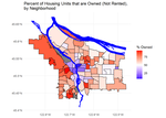
Home Ownership in Portland, OR
The Data: Portland, OR 2010 Census Data Portland provides open access maps and GIS data as well as census data. Here I chose to focus on data from each Portland neighborhood describing the number of individuals who either own their housing versus rent their housing.
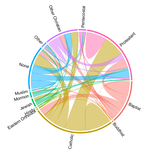
Chord Diagrams: Religious Composition of Romantic Partners
Also known as “radial network diagrams”, chord diagrams are useful for representing connections between groups (“nodes”). The nodes are circularly arranged and relationships are represented using “chords” connecting two nodes.
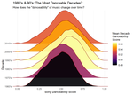
The Ridgeline Plot: Danceability Across the Ages
Ridgeline plots are a variation of density plots in which you aim to compare the distributions of several categorical variables (represented on the y-axis) for a single continuous variable (represented on the x-axis).
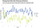
Resting Heart Rate after Pulmonary Embolism
The Data: Personal Fitbit Heart Rate Data I’ve been wearing a Fitbit for nearly two years at this point and as a result, I have a lot of data on my heart rate, sleep, and activity.
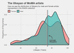
The lifespan of MoMA artists
The Data: The New York MoMA Collection From Data Is Plural:
This July, the Museum of Modern Art published a dataset containing 120,000 artworks from its catalog, joining the UK’s Tate, the Smithsonian’s Cooper Hewitt, and other forward-thinking museums.